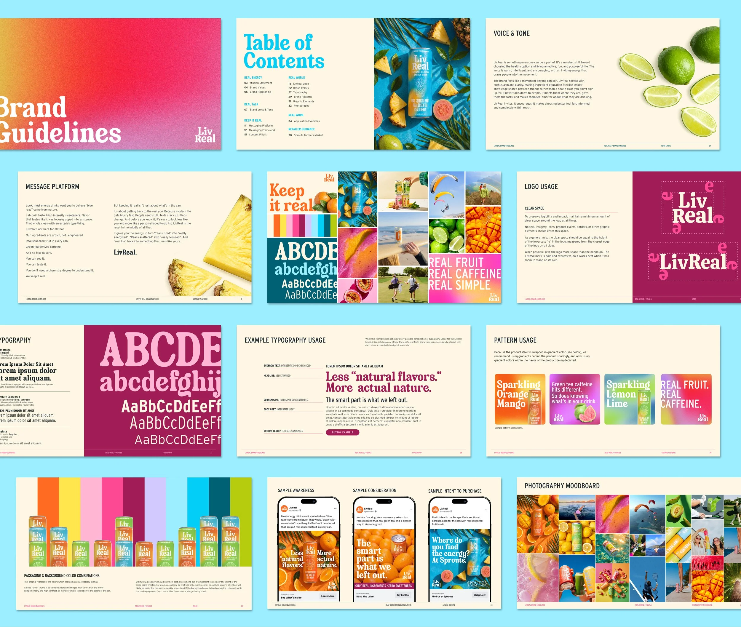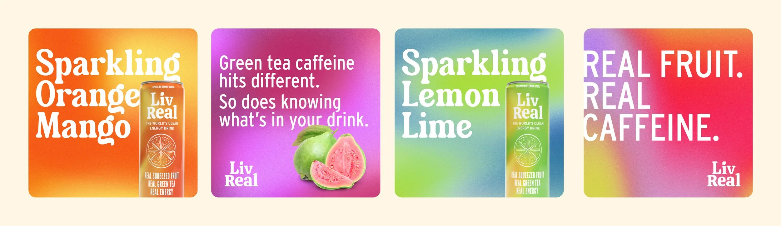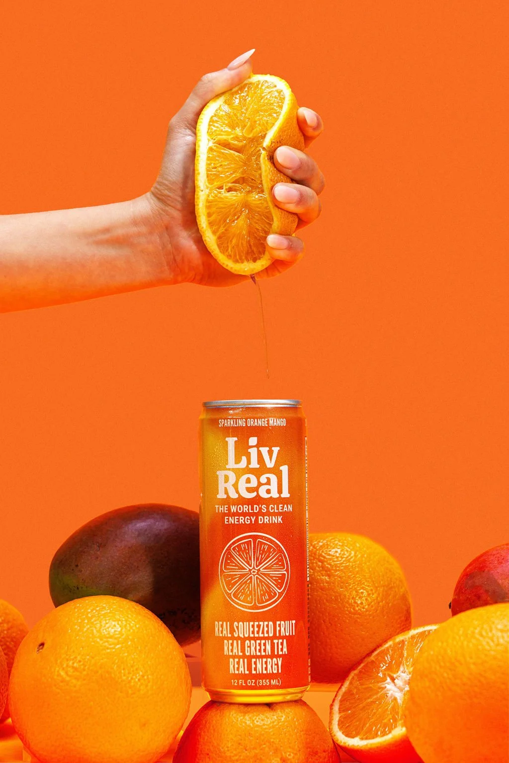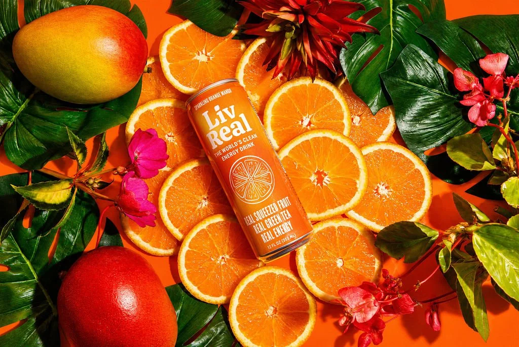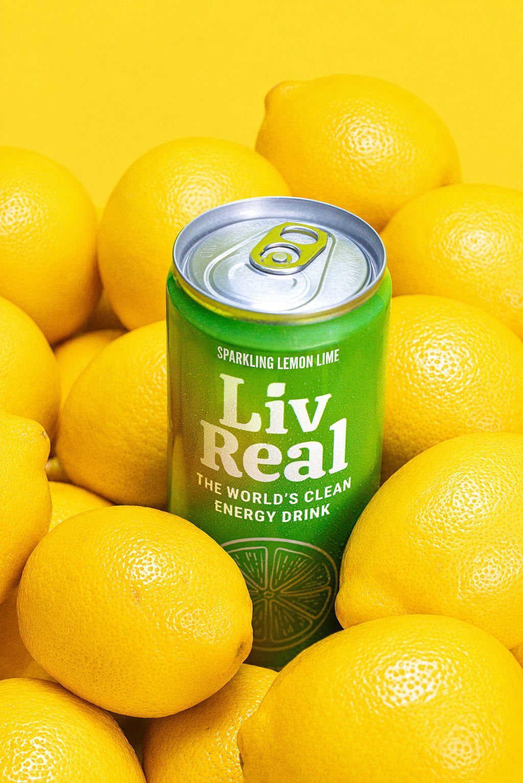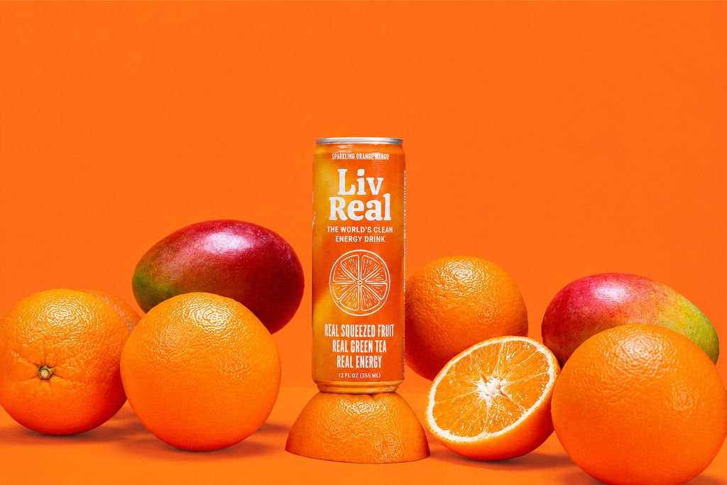
LivReal set out to redefine what an energy drink could look and feel like. Built around the belief that everyday energy should come from real ingredients—not artificial shortcuts—the brand needed an identity that felt as fresh, honest, and approachable as the product itself.
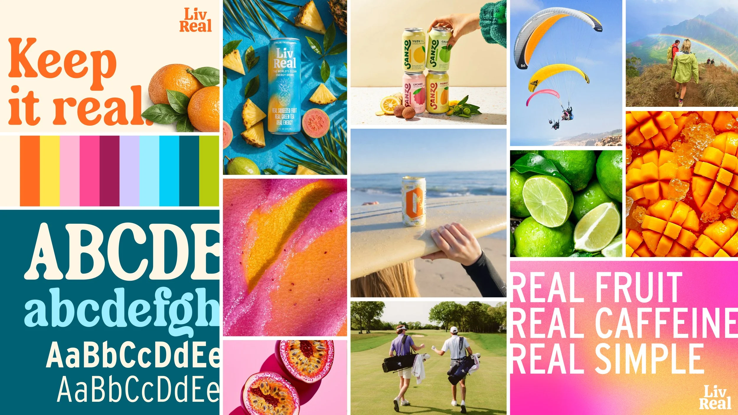
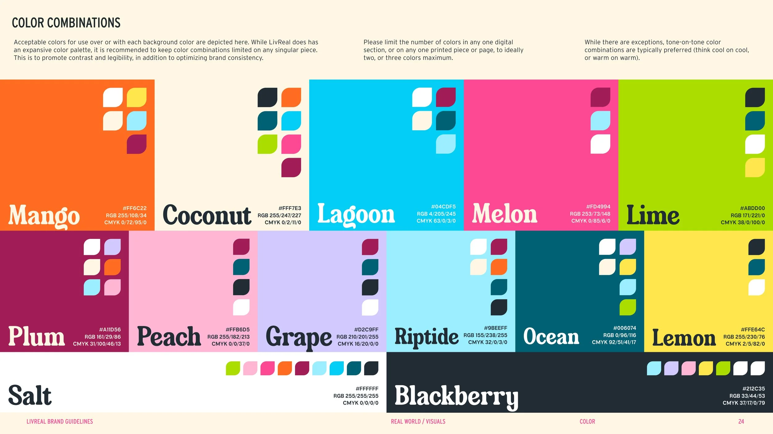
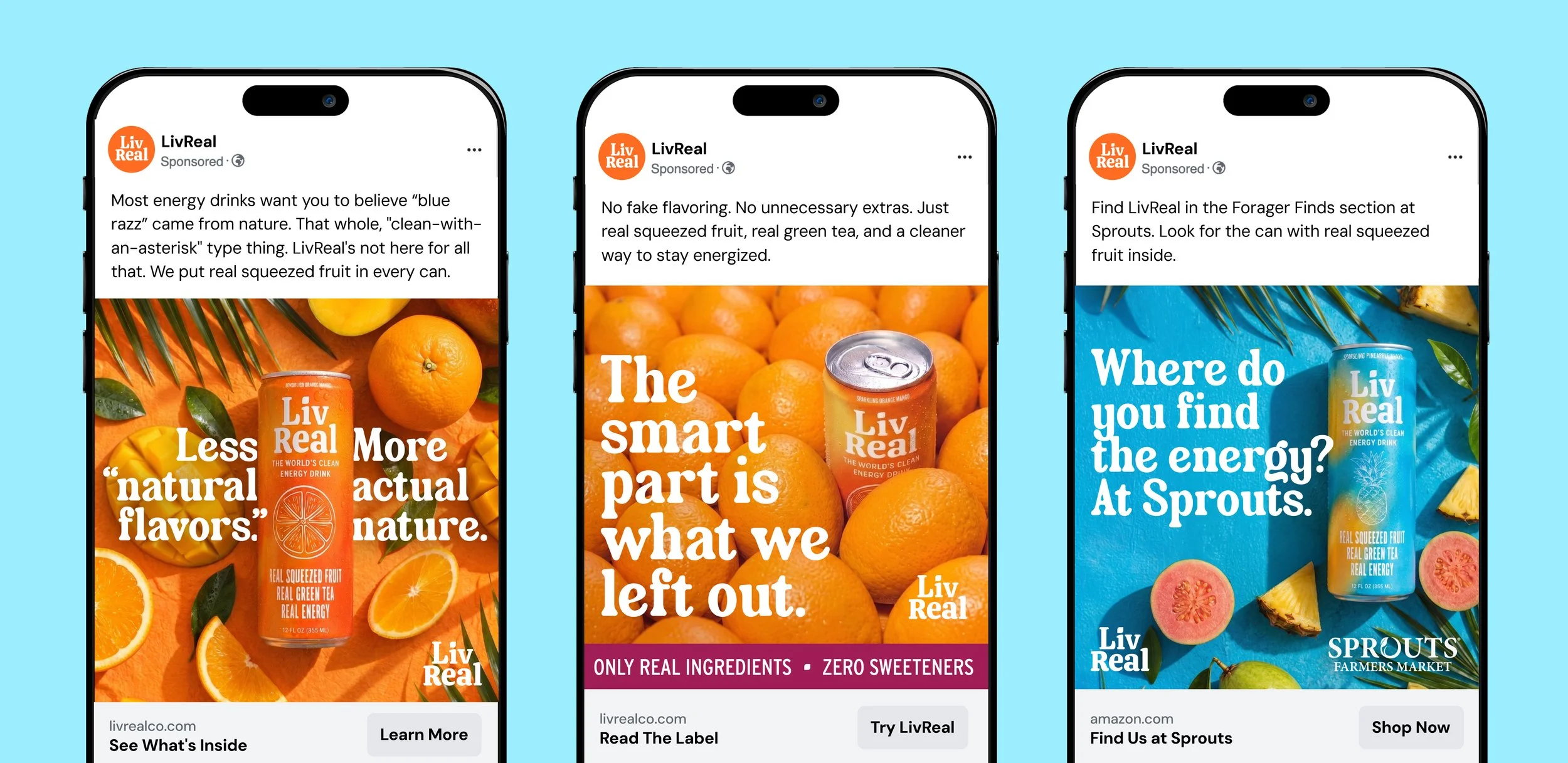
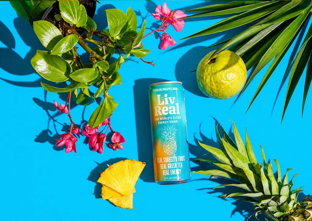
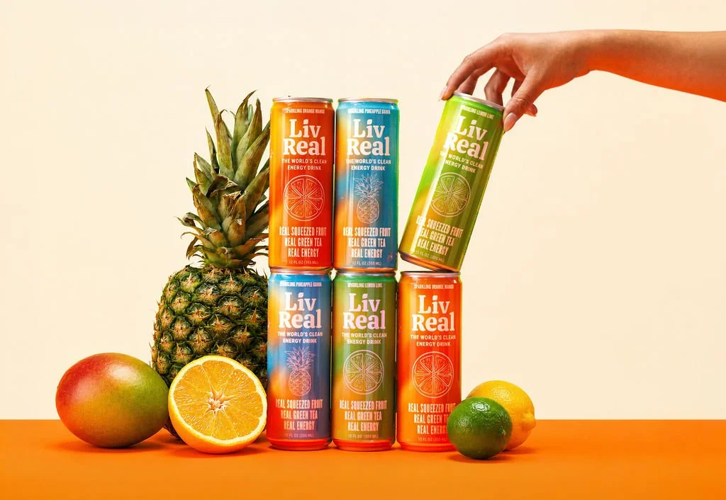
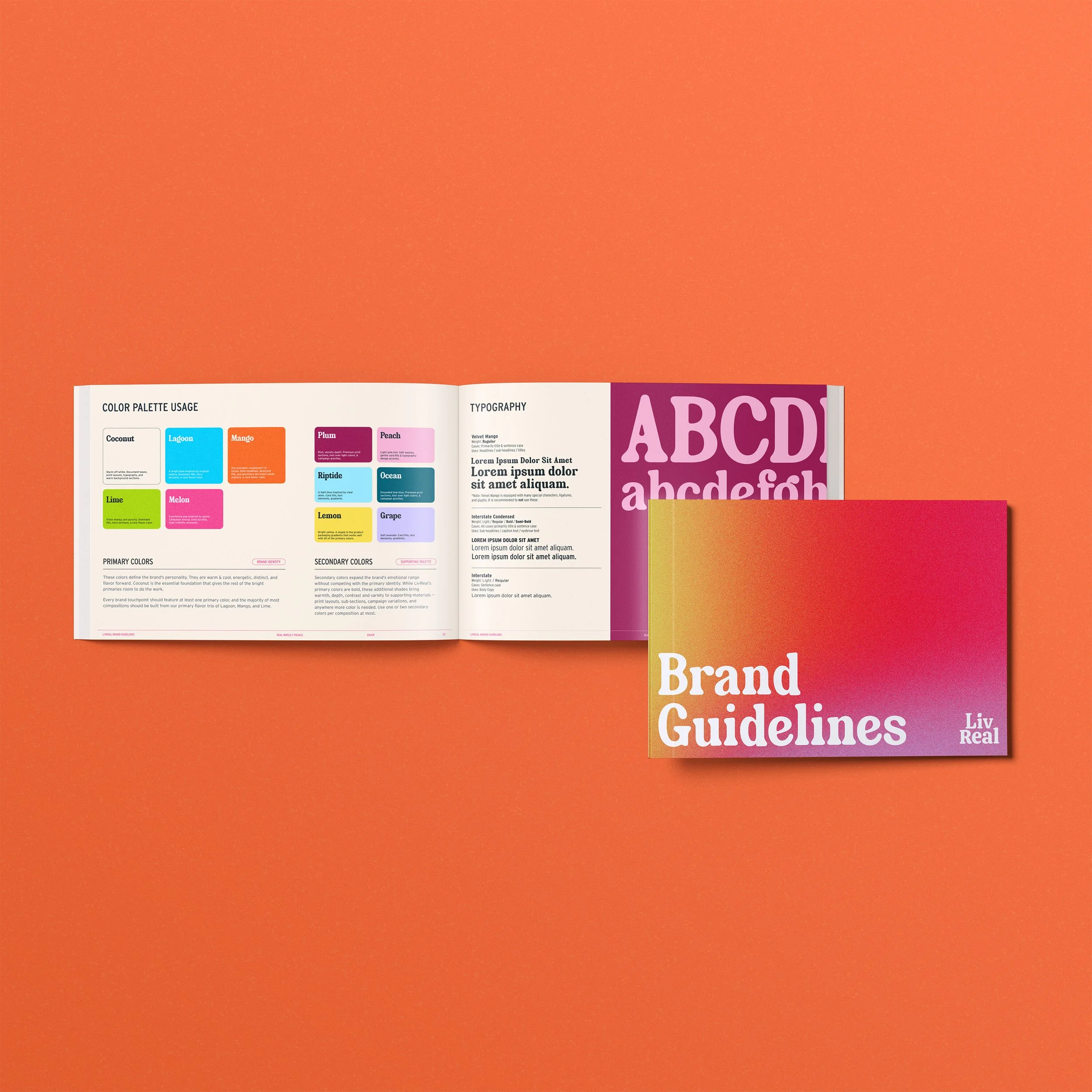
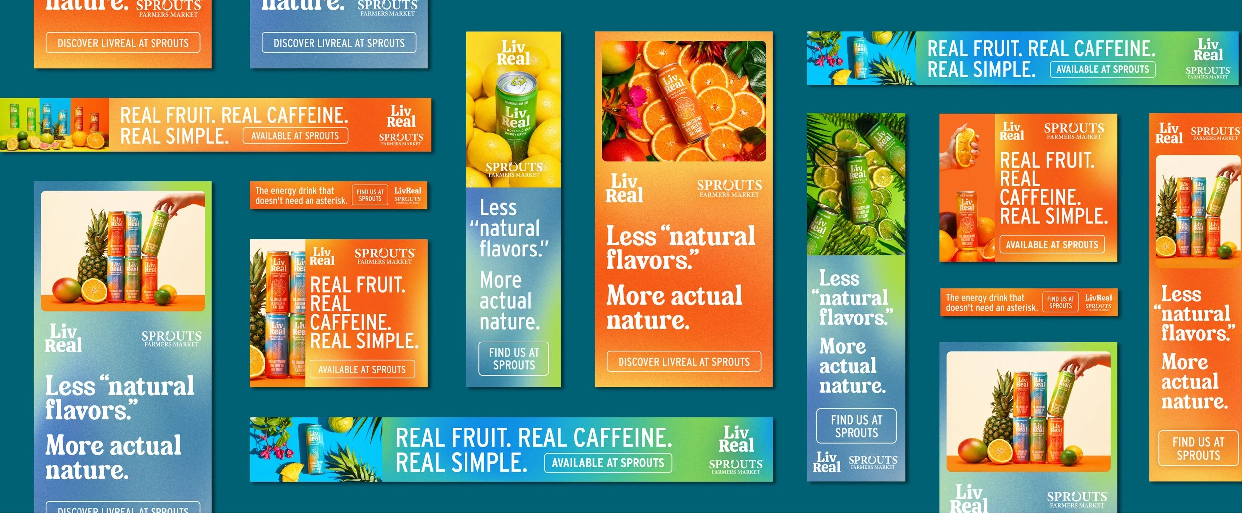
My role included art direction, identity design, brand guideline development, and digital campaign creative. The resulting system pairs expressive color with approachable typography, fresh and appetizing imagery, and intentional whitespace to create a visual language that feels energetic without relying on the aggressive aesthetics typical of the category. Every element was designed to reinforce LivReal's commitment to transparency, wellness, and making clean energy feel simple, optimistic, and unmistakably real.
Keep it real.
Keep it real.